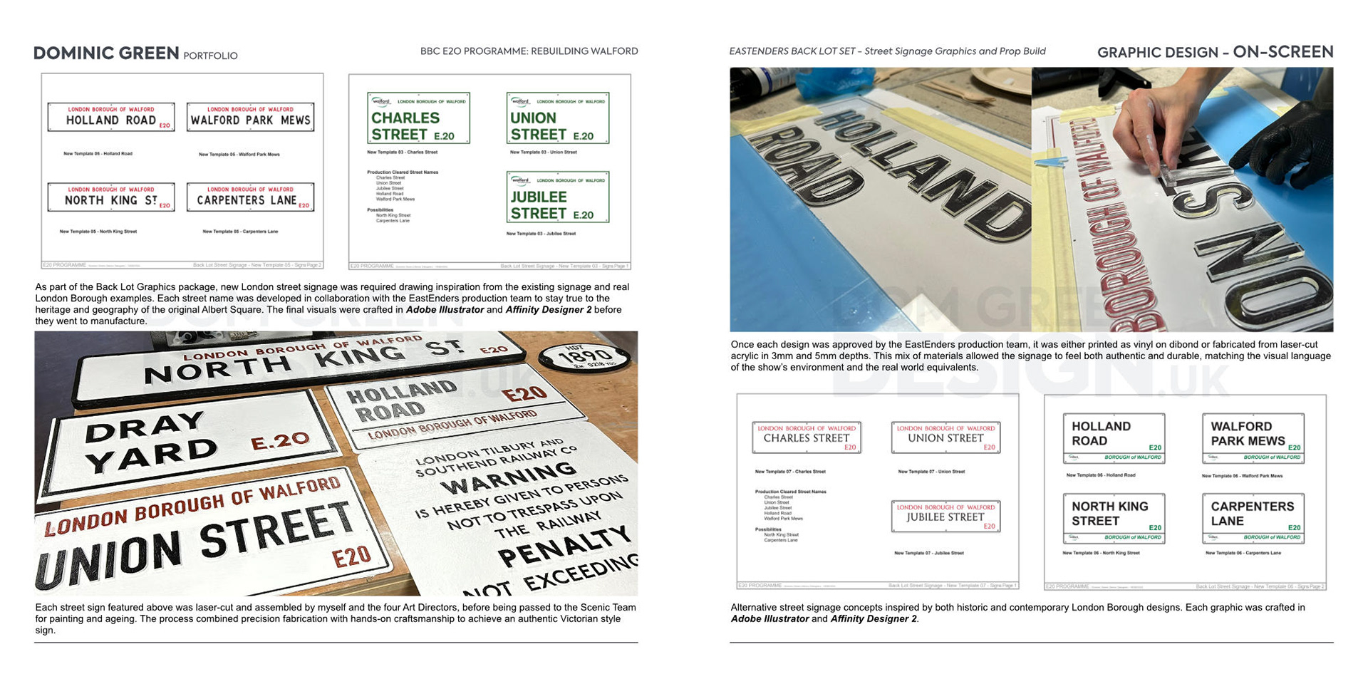
Each street sign featured above was laser‑cut and assembled by myself and the four Art Directors, before being passed to the Scenic Team for painting and ageing. The process combined precision fabrication with hands‑on craftsmanship to achieve an authentic Victorian style sign.
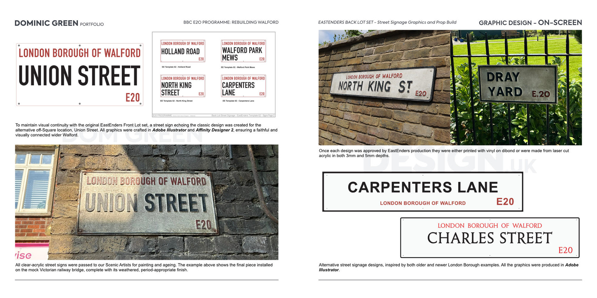
All clear‑acrylic street signs were passed to our Scenic Artists for painting and ageing. The example above shows the final piece installed on the mock Victorian railway bridge, complete with its weathered, period‑appropriate finish.
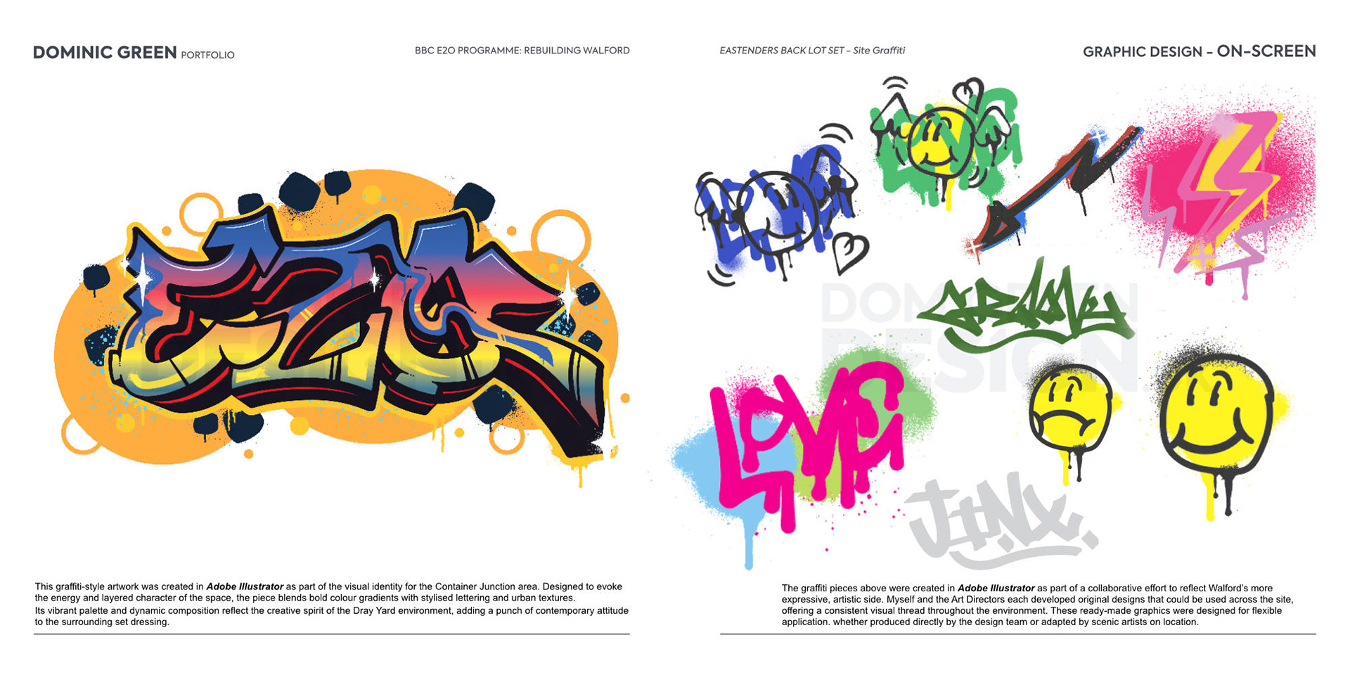
This graffiti-style artwork was created in Adobe Illustrator as part of the visual identity for the Container Junction area. Designed to evoke the energy and layered character of the space, the piece blends bold colour gradients with stylised lettering and urban textures.
Its vibrant palette and dynamic composition reflect the creative spirit of the Dray Yard environment, adding a punch of contemporary attitude to the surrounding set dressing.
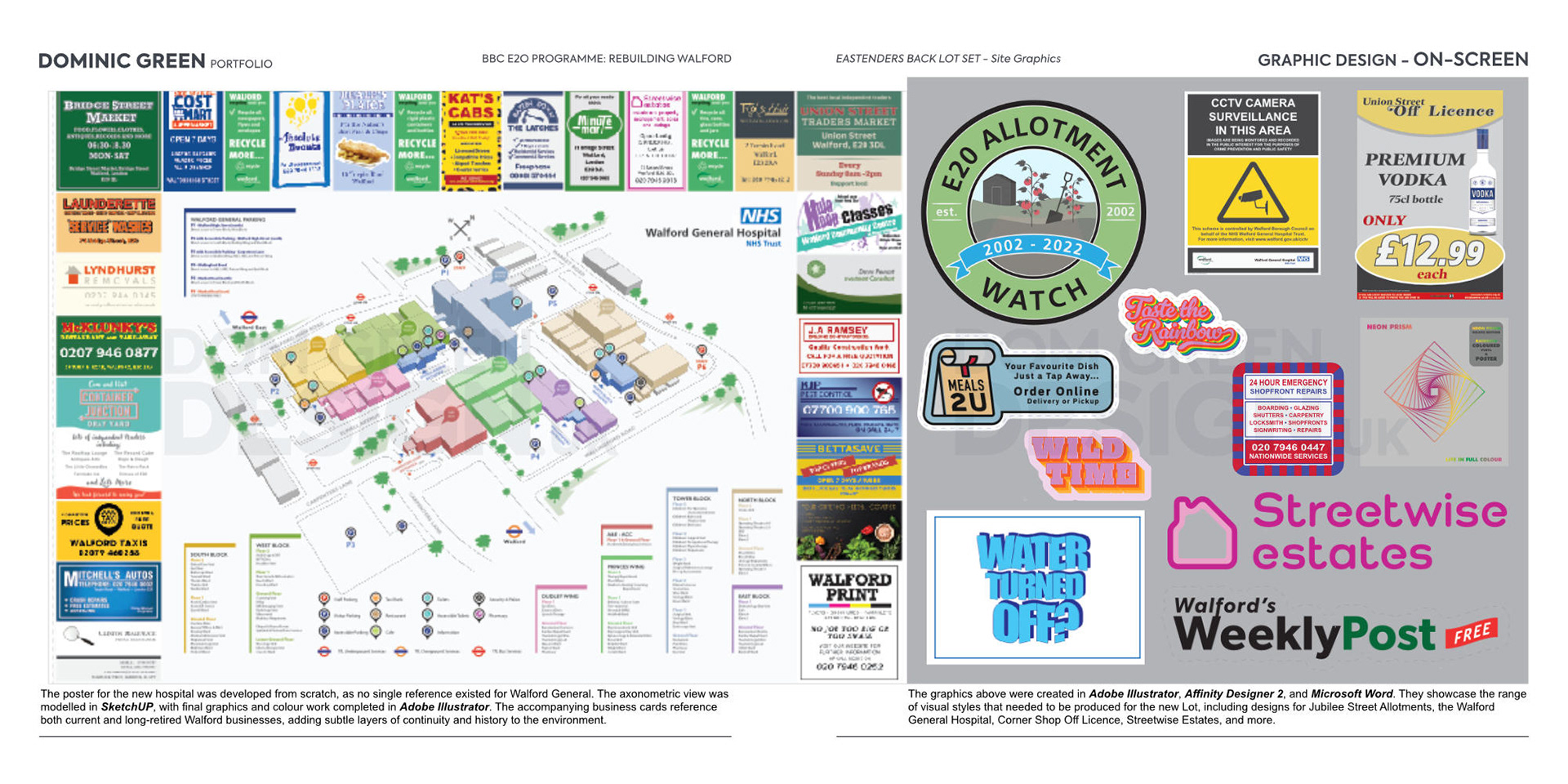
The poster for the new hospital was developed from scratch, as no single reference existed for Walford General within the archives. The axonometric view was modelled in SketchUP, with final graphics and colour work completed in Adobe Illustrator. The accompanying business cards reference both current and long‑retired Walford businesses, adding subtle layers of continuity and history to the environment.
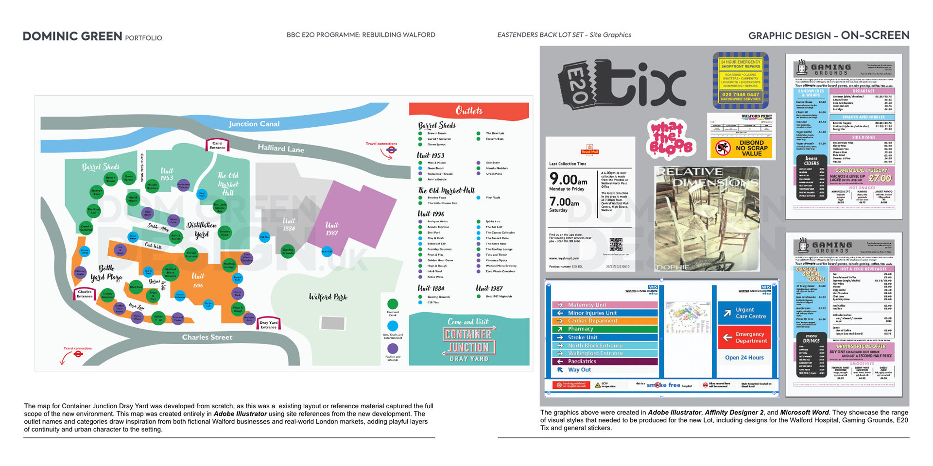
The map for Container Junction Dray Yard was developed from scratch, as this was a existing layout or reference material captured the full scope of the new environment. This map was created entirely in Adobe Illustrator using site references from the new development. The outlet names and categories draw inspiration from both fictional Walford businesses and real‑world London markets, adding playful layers of continuity and urban character to the setting.
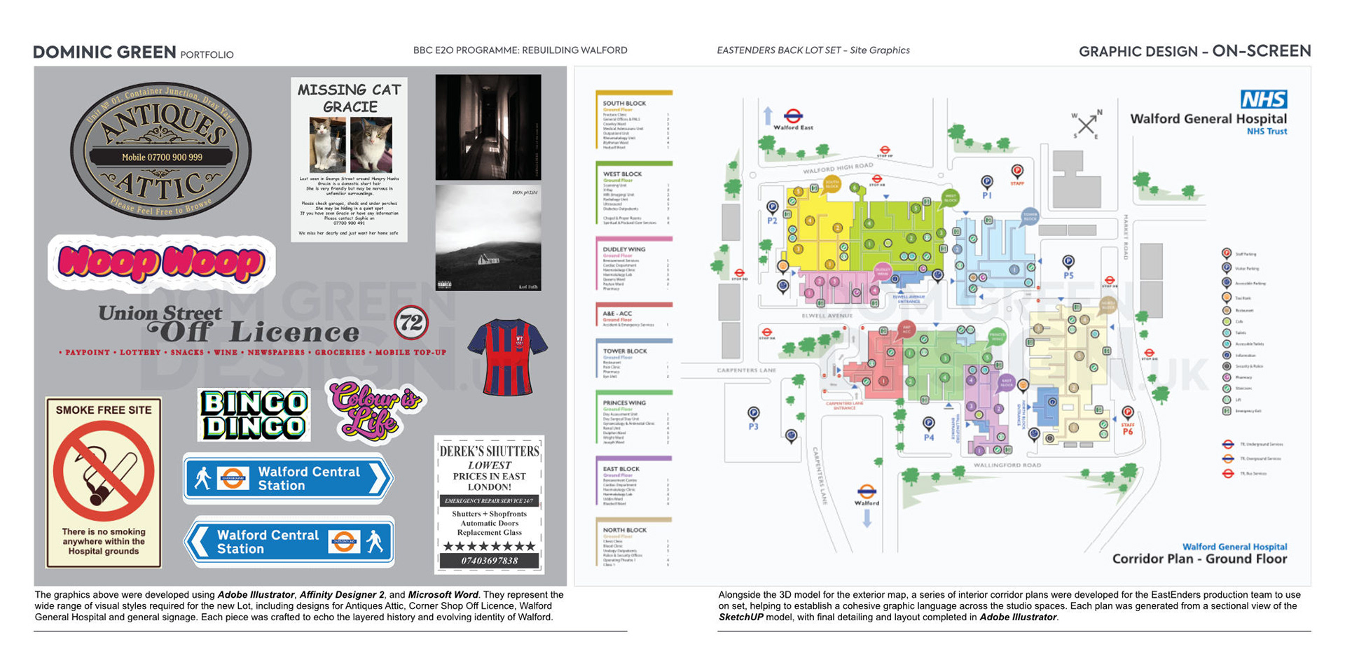
The graphics above were developed using Adobe Illustrator, Affinity Designer 2, and Microsoft Word. They represent the wide range of visual styles required for the new Lot, including designs for Antiques Attic, Corner Shop Off Licence, Walford General Hospital and general signage. Each piece was crafted to echo the layered history and evolving identity of Walford.
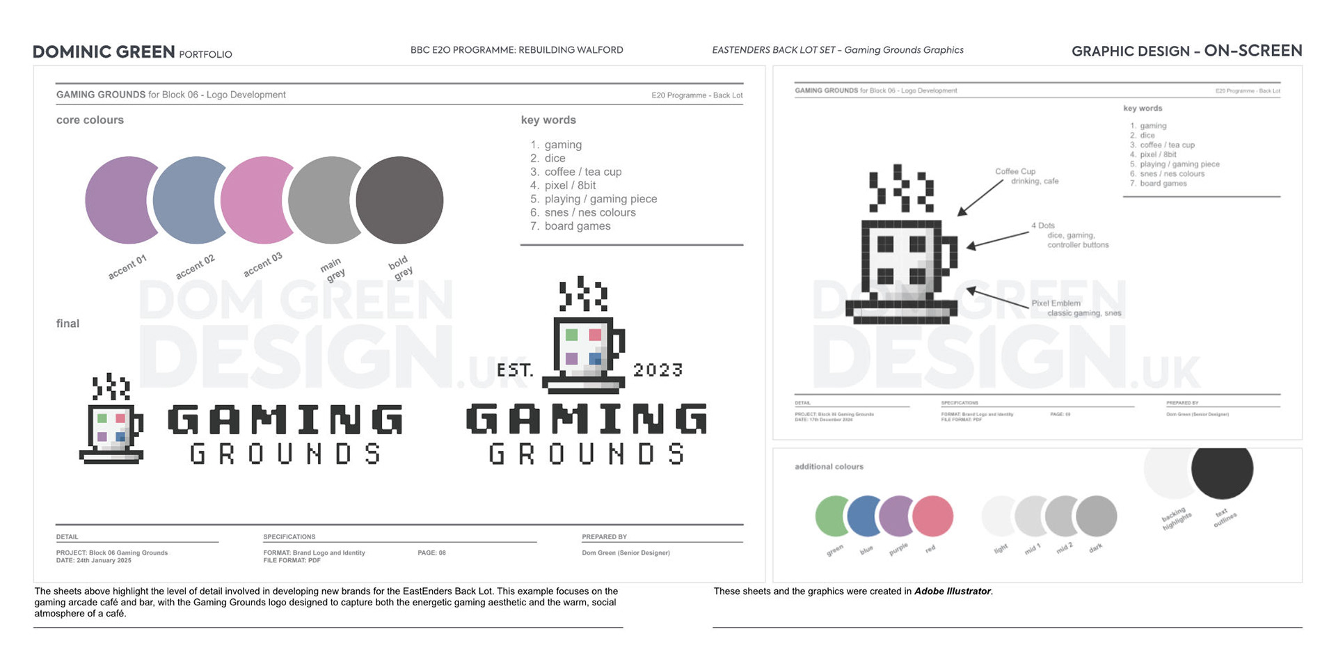
The sheets above highlight the level of detail involved in developing new brands for the EastEnders Back Lot. This example focuses on the gaming arcade café and bar, with the Gaming Grounds logo designed to capture both the energetic gaming aesthetic and the warm, social atmosphere of a café.
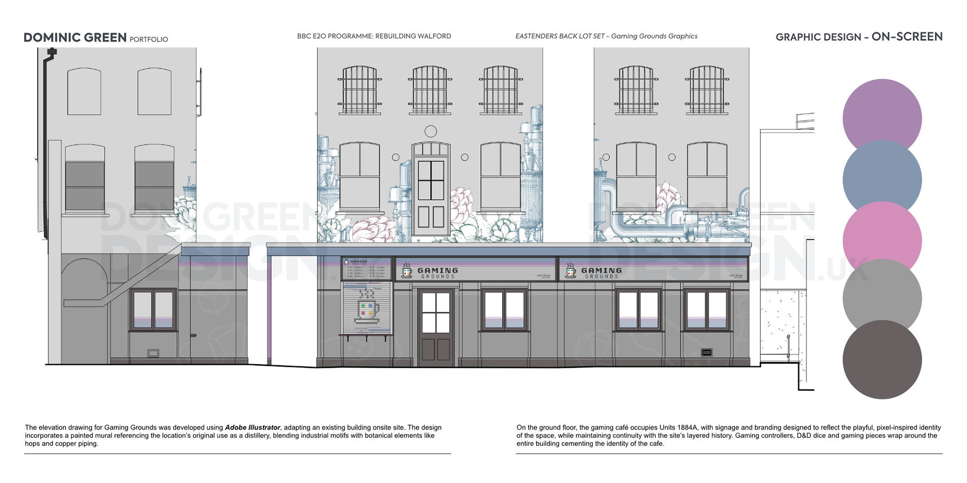
The elevation drawing for Gaming Grounds was developed using Adobe Illustrator, adapting an existing building onsite site. The design incorporates a painted mural referencing the location’s original use as a distillery, blending industrial motifs with botanical elements like hops and copper piping.
On the ground floor, the gaming café occupies Units 1884A, with signage and branding designed to reflect the playful, pixel-inspired identity of the space, while maintaining continuity with the site’s layered history. Gaming controllers, D&D dice and gaming pieces wrap around the entire building cementing the identity of the cafe.